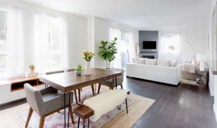
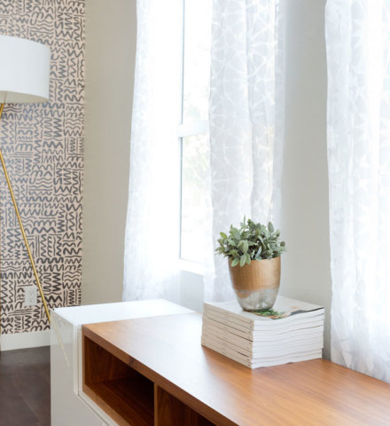
Trelawny Davis and Jackie Sosa are old friends but had never lived together. Two millennials with fast-paced jobs looking for a relaxing place to call home in L.A., they decided to team up and sign a lease together. They quickly lucked out with a sun-drenched apartment in West Hollywood with soaring square footage…but their interior design process took more time. Trelawny describes her style as “classic, mid-century” while Jackie prefers a more modern look. So how do you create a space that speaks to two different personalities? Find common ground. The roommates set priorities that would complement – rather than cancel out – each other’s aesthetics: A subdued color palette, a comfortable living room that could accommodate a crowd, and a dining area that welcomed mealtime gatherings. Most importantly, however, they agreed to take their time. “It’s a process. Designing a space that feels authentic – especially for two people – requires patience,” Trelawny advises. “We searched online and scoured Pinterest for inspiration. But the key is not to replicate what you see on the internet. Instead of copying, find your own style.” Here’s how they did just that – and without breaking the bank.
Living Room
“We agreed the living room would be our first endeavor,” Jackie shares. “I work in television and we host regular movie nights, so the TV was essential.” “We spend an embarrassing amount of time watching TV,” Trelawny jokes. “We designed the space knowing we’d spend most of our time here.”
They each had a couch already, so they added other comfortable pieces – like a shaggy wool rug and poufs – and then relied on decorative touches (throw pillows and artwork) to create visual cohesion. “The Pink Cactus art from Minted and the printed pillows added color contrast, and ultimately tied the room together,” Trelawny says. “But most important, everyone has a place to sit during The Bachelor!” Jackie quips.

Dining Room
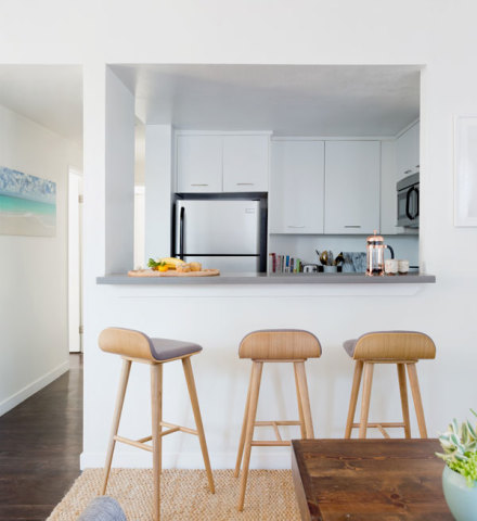
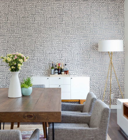
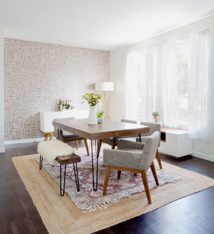
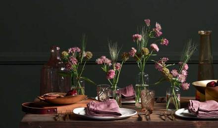
A spacious dining room thrilled the roommates (both love to cook and entertain), but it proved to be the most challenging room of the home to complete. It started easily enough: Barstools to line the countertop so friends could hang out while meals are being prepared, a large custom table to host dinner parties, and dining chairs from Article that added a sophisticated – but never stuffy – vibe.
Bedrooms
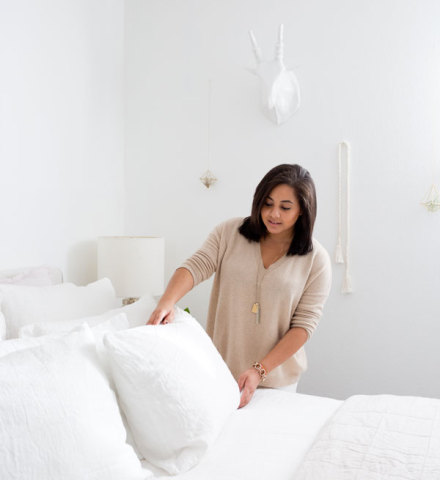
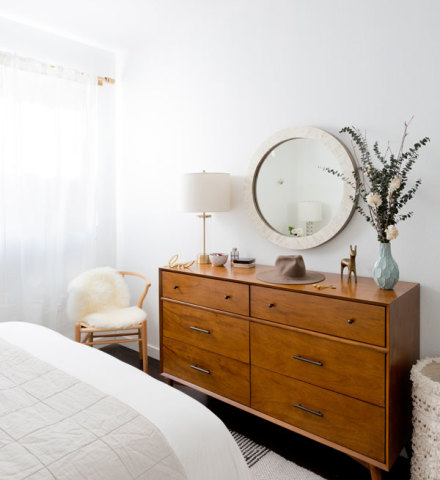
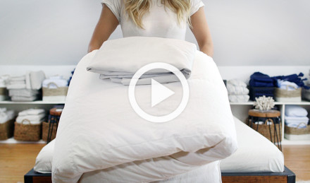
Trelawny and Jackie’s distinctive styles are on full display in their bedrooms. While their individual tastes may differ, choosing Parachute bedding as their bedrooms’ focus was a no-brainer. “I wanted a classic, warmer palette with an emphasis on texture and neutrals,” Trelawny describes. She paired a white Linen Venice Set with an essential quilt in oatmeal. The upholstered Dean bed frame by Living Spaces is soft yet sturdy – and really anchors the room. She finished the look with an affordable mid-century-inspired dresser from Living Spaces, nightstands from West Elm that she’d purchased years ago, and a single watercolor print above the bed. “I wanted my bedroom to be calming and pure, but I also didn’t want it to look washed out. The Morning River print from Minted offers a splash of blue and red. Plus they’re a really cool company that has a great relationship with their artists. There’s a ton of amazing artwork and framing options. I had a tough time choosing…but I think I got it right.”

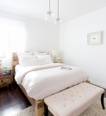
Jackie’s bedroom is more industrial modern, by comparison. The Globe Pendant Chandeliers from West Elm cast a dramatic first impression. She mixed wood furniture with metal and mirrored fixtures, and softened the look with blush and white linen bedding. “Blush is a neutral color with a twist – it captures the eye but won’t overwhelm a room,” Jackie explains. “Pillows are also key. Don’t scrimp on pillows! They add comfort and elevate the entire room.”
The bedrooms reveal strikingly different design personalities, which makes their shared living space all the more remarkable. “Both of our sensibilities are represented in this apartment,” Trelawny declares. “Clear communication, patience, and an embrace of white space go a long way when creating a home both you and your roommate love.”

[Ed. note: The Striped Cashmere Throw has sold out.]
[Ed. note: The Striped Cashmere Throw has sold out.]
