A Quilt represents love, tradition, friendship – and warmth, of course. While we enjoy this heirloom association, how do you spin its look into something fresh and modern that says NOW? Don’t ask us, ask the experts: Our Product team! With our Quilt, they captured the timeless appeal of Quilts – without the kitsch. Here’s the 4-1-1 on how the quilt collection came to be, how to style it at home, and why it’s a smart investment for year-round use.
The Design
The Design
What was the design process for the Quilts?
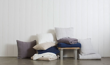
Amy Hoban, Creative Director:We actually had a very difficult time developing the Quilts. We constructed a nine by nine-inch classic square pattern and sent it to multiple manufacturers for samples. What we first got back was not what we had in mind: The fabrics were very stiff and felt reminiscent of hospital blankets. It took a lot of trial and error, and eventually we turned to our linen vendor to produce the Quilts. They used linen on the face and percale on the back for added character. The first time we saw their work, we realized, “Oh, they know what they’re doing!”
Why introduce Quilts?
Amy:Quilts were one of the first things I designed for Parachute. I saw an opportunity to add a layering option to our core bedding line. We had sheets, we had duvets – but we didn’t have that something extra. I knew it would be a hit! Some people want to use a quilt instead of a duvet or add the Quilt on top of their bedding for extra warmth. It’s very versatile.
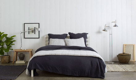
The Quilt has a 100% linen front and a 100% percale reverse. So that leaves us wondering…how is the Quilt made?
Meghan McGrady, Product Development Manager:The Quilt is garment washed (dyed after it’s sewn). Not only do the front and back of the Quilt feel different, but each side holds dye in a unique way. This technique gives the Quilt the “heritage” look we wanted to achieve.
A lot of customers are interested in the weight of the quilt – and what’s inside it. Is there a fill or is this simply a result of the two fabrics combined?
Amy:Batting is used to fill quilts. When you make a quilt, you have the top layer of fabric, the bottom layer of fabric, and then you put the batting between the two. A machine sews the layers together before it’s dyed.
Meghan:The batting comes in sheets. Some quilts are filled with thicker batting that creates a big fluffy effect. We use a thin layer of batting in our Quilts.
Quilts have an old-timey or crafty association. How did you modernize this classic textile?
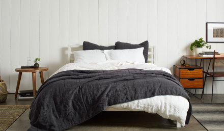
Amy:Using one color, as opposed to multiple colors, makes it far more modern. You see a lot of old-timey quilts in white, red, blue and grey with a very specific star or log house pattern. Doing something simple and clean with the oversized box really sets our Quilts apart. We utilize all the amazing aspects of quilts without the kitsch.
The Styling
The Styling
What are three ways to style a Quilt?
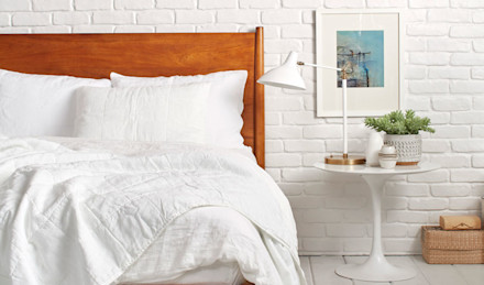
Amy:I’m always cold in the winter, so I have a duvet and keep my Quilt folded at the foot of the bed for chilly nights. Another option is to layer the Quilt under the duvet and fold the duvet over (like a hotel).
Meghan:You can style your Quilt over just a top sheet in the warmer months. If you live in a mild climate or like to change the look of your bed with the seasons, this is a nice light option. I slept with just the Quilt and a top sheet last summer – it was a game changer! We’ve also seen a lot of influencers bring the Quilt into the living room. They drape it on the sofa and tuck it into the cushions. It’s a very chic look.
Favorite Quilt and bedding combination?
Amy:I have white bedding and the white quilt. After looking at our samples and designs all day, I like coming home to white. I love the different textural layers the Quilt adds to my bed.
Meghan:After seeing our shoot, I like the fog Quilt with the coal linen. The light grey and dark coal is incredibly striking.
Are you a percale or linen side up when it comes to our Quilts?
Amy:Always linen side up! The percale is meant to be face down because of the hem. It looks great either way, though.
Are you a percale or linen side up when it comes to our Quilts?
Amy:Always linen side up! The percale is meant to be face down because of the hem. It looks great either way, though.
Can we expect to see more colors in the near future?
Amy:Oh yes! We are in the process of dipping coal now.
Meghan:We’ve done light, I think it’s time to swing in a darker direction…
Can we expect to see more colors in the near future?
Amy:Oh yes! We are in the process of dipping coal now.
Meghan:We’ve done light, I think it’s time to swing in a darker direction…
The Shoot
The Shoot
Our Quilts are a modern take on the classic. How important are the props in conveying a look that is current?
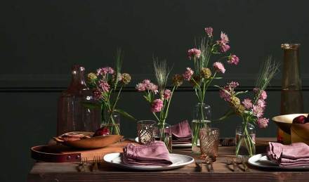
Amy:The most important part about props is that it feels on brand. Keeping the images consistent with the other product photos on the website is a must. Scott knows exactly what to pull – he hits the nail on the head every time! I told him we would be keeping things light but that we would need a second set of props for a dark moody shot. We’ll be selling the Quilts year-round as well and need to have options.
Meghan:At this point, Scott knows Parachute, and it’s really nice to have synergy with everyone involved in the process.
How would you describe the vibe of the Quilt shoot in three words?
Amy:Fun, collaborative and slightly irreverent. It’s one big family, so we’re all very open with each other on set. We had some extra time, so I asked everyone to bring their ideas for shots we could get the last day. We ended up getting some amazing overhead photos as a result (thanks Scott)! We’re lucky to have such a creative crew.
How is photographing the Quilts different from shooting our sheets? Do you approach them differently? Which aspects of the Quilt did you seek to highlight in the photography?
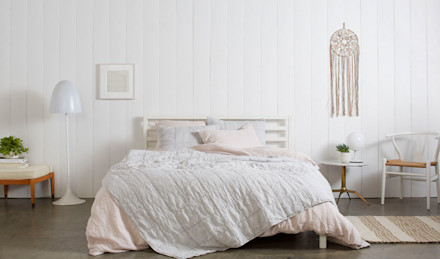
Nicole LaMotte, Photographer:In general, we try to keep the look and lighting consistent across the bedding categories. We want it to look cohesive on set and on the website. We pay extra close attention to the light, and sometimes adjustments must be made in post-production. Since fog is such a subtle color, we had to watch the light constantly! With all product shoots we do a color card, which allows you to define neutral grey. Every color is made up of other colors – the camera sees things differently than the naked eye. Shooting fog was a very delicate and precise process.
